General
-
Cell-based architectures: the pendulum swings back

Cell-based architecture is an approach to software design that is particularly relevant to microservices and distributed systems. It strives to solve several key challenges associated with these environments, addressing scalability, reliability, manageability, and continuous delivery issues. Background As systems grow in complexity, traditional monolithic architectures become cumbersome to manage. Every change requires redeploying the entire… Continue reading
-
The IMD Smart City Index 2020 report reveals interesting trends (with Excel download)

Not long ago, the Institute for Management Development (IMD) published their Smart City Index 2020 report, ranking cities worldwide according to their “smartness” levels. For the IMD, “a ‘smart city’ continues to be defined as an urban setting that applies technology to enhance the benefits and diminish the shortcomings of urbanization for its citizens.“. The… Continue reading
-
Customer Journey Diagrams

Customer Journey diagrams have been around for a while now. They are another great tool to help you think about the interactions between you and your customers. You can use them to analyze or convey the positive and negative interactions (a.k.a. paint-points) your customers have with your company or brand. Here’s an example of what… Continue reading
-
Determine your business integration strategy
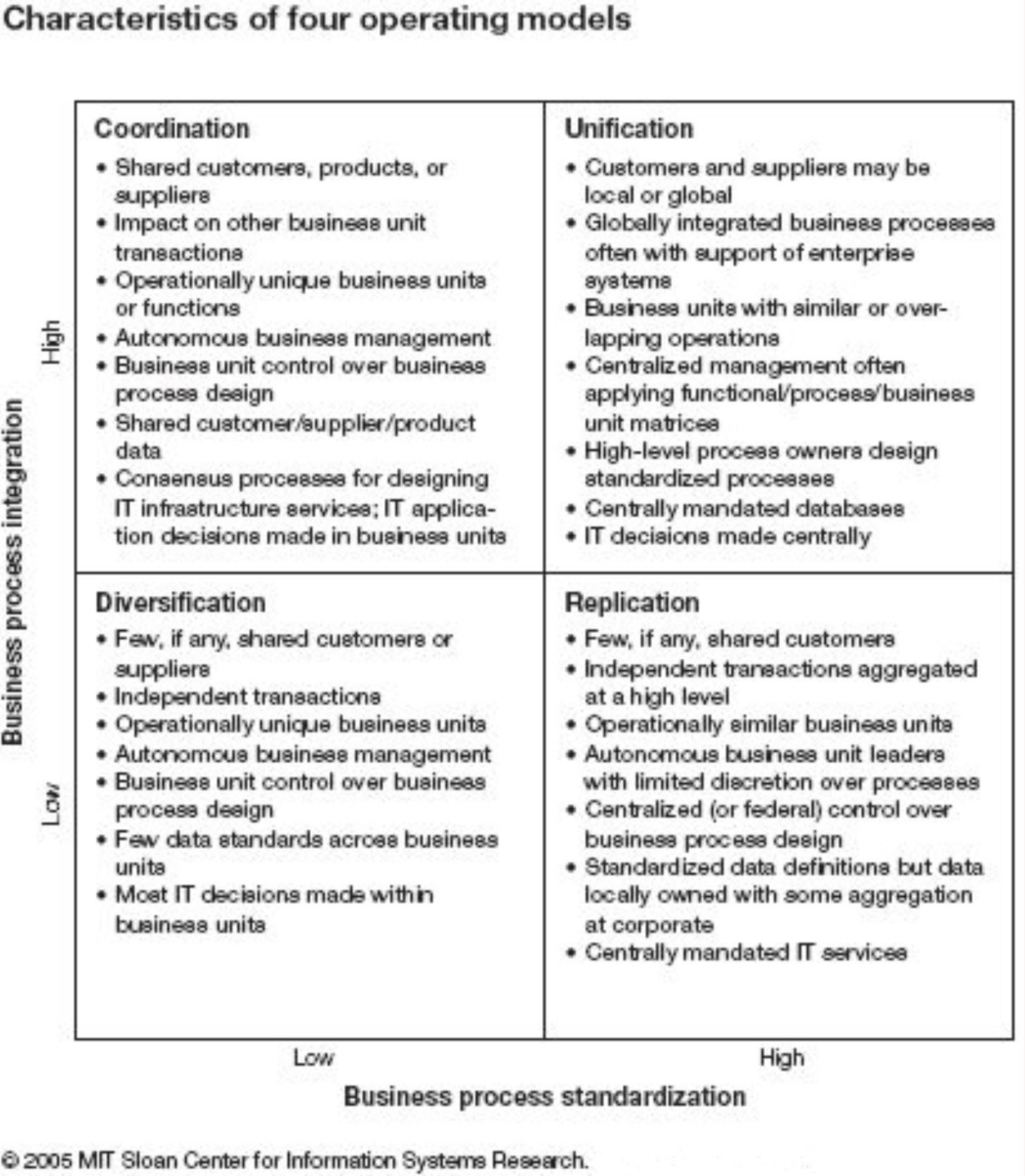
In order to apply a sound IT (Integration) Strategy in a multi-entity environment, it is important to understand the business integration strategy. Continue reading
-
Capability Wheel: a nice variation on the iceberg diagram

The Capability wheel is another representation of the Iceberg Diagram. It represents all the capabilities that matter above sea-level and below sea-level in a circular fashion as depicted in the diagram below: It is a visual appealing way and shows in a blink of the eye how much is hidden under the surface. In the following… Continue reading
-
Being S.M.A.R.T. About your objectives
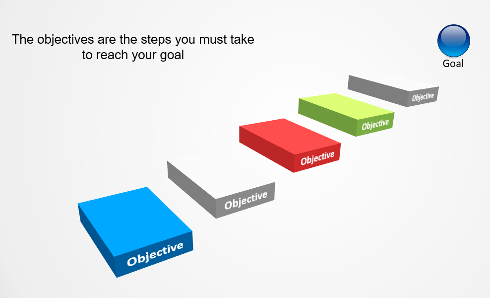
Goals and objectives are often used interchangeably, but they are different. Here’s a good definition that I found on the michigan.gov website: Goals are general guidelines that explain what you want to achieve in your community. They are usually long-term and represent global visions such as “protect public health and safety.” Objectives define strategies or… Continue reading
-
The rise and growth of the UI Layer

In the early days of the browser-based internet, the UI layer was gold-paper thin. Browsers were not even capable of processing user input from day one. Computers were slow and didn’t have a lot of memory or video capabilities. Cascading Style Sheets (CSS), the iPhone, Android hadn’t been invented yet. And so the logical consequence… Continue reading
-
The RACI Matrix
The Responsible-Accountable-Consulted-Informed (RACI) matrix is another useful and widely used communication means. A good one clearly and concisely shows which person or organization has a stake (and which one) in specific tasks. This helps to clarify who is supposed to do what. It also makes sure everyone clearly now what is expected of them. Let’s… Continue reading
-
Interesting Azure Service Decision Trees
We’ve documented the advantages of using Decision Trees in the past. Here’re two interesting examples: choosing a candidate compute service. choosing a load balancer Both guide you to the service that best matches your needs, through a series of questions. Choosing a candidate compute service Azure like other cloud providers has a number of Compute… Continue reading
-
Option Comparison Heat map
Another interesting diagram or table in this case is the Option Comparison Heat Map. One swift glance is all it takes for its readers to see where the weaknesses and the strength of every option lies. As well as the reason for this weakness or strength. And that’s where it differs from a Spider chart. … Continue reading
About Me
As an experienced enterprise architect with a deep-rooted passion for cloud, AI, and architectural design, I’ve guided numerous companies through the management of their existing application landscapes and facilitated their transition to a future state.